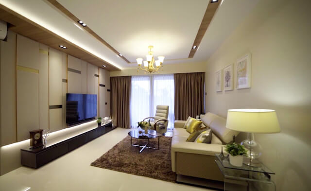
25-Year-Old Condo Interior Transformation @ Farrer Drive
This house renovation project refreshes an old gem into its contemporary version – with a home makeover to breathe new life into this 25-year-old condo at Farrer Drive, Sommervale Park. Owned by a middle-aged married couple, they wish to revamp their condo interior design to extend their stay and enjoy better quality living together with their beloved pet dog.
Restoring the space
A complete overhaul is done to the 3-bedroom condo, sprawling approximately over 1,200 square foot. Major changes are done to the bathroom, kitchen and living room to restore its condition and enhance its functionality for everyday use.
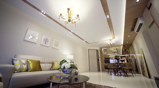
The renovation works include floor hacking, rewiring and redoing of the floor ceiling. This improves the existing structures to make way for new additions and upgrades. Homogeneous tiles are also used, which are best for long-term purposes as they are relatively more resistant to chipping and scratching.
Breathe new life into the old
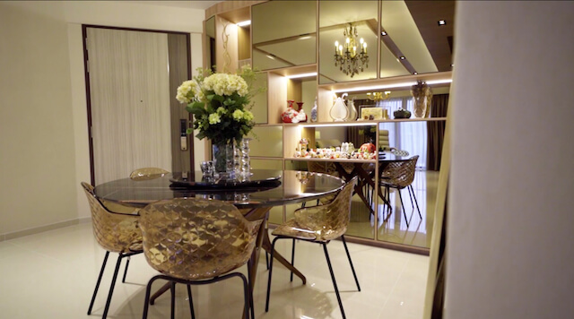
Previously, the owners had solid brown cabinets and carpentry around the living room and kitchen. The living space was given a refreshed look using lighter hues, such as beige and cream colours, and incorporate mirrors which blend seamlessly with the interior design. The new cabinets go well with a much sleeker dining table for a more contemporary look.
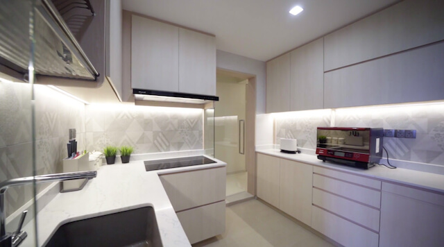
The kitchen features light wood to bring a slightly warmer, Scandi-inspired aesthetic. The pale wood finishes are beautifully paired with whitewashed tiles to balance each other nicely. This makes the kitchen looks brighter and airy, making it a more inviting, homely space.
A brand new look
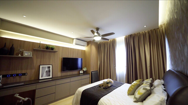
The master bedroom was customized with wallpaper design that complements the surrounding wood carpentry and textures. With plenty of brown hues and shades, this personal space exudes warmth and coziness, perfect as a private sanctuary to retreat from the rest of the house and world. The long cabinets also function as a TV console as well as a desk space for the homeowners to use their laptop conveniently.
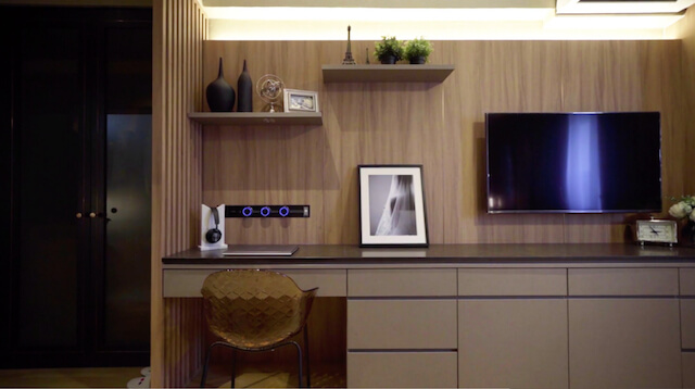
A sleek dark-coloured wardrobe at the corner of the bedroom ties the whole look together. It is fitted with an automatic light switch, which turns on the moment the wardrobe door is opened – this offers a modern touch as well as provides for better visual.
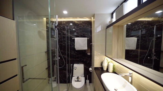
The bathroom renovation gave the interior design an updated look, with dark-coloured wall tiles that create just the right amount of contrast with the adjacent wall tiles in a lighter shade. The expansive mirror is made as the focal point of the bathroom, giving the impression of a larger space.
Got a renovation idea to bring back the long-lost grace of your house? Restore your old home to its former glory with Thom Signature. Our interior design company also work with new BTO homes and landed properties that you can live and take pride in.



No Comments
Sorry, the comment form is closed at this time.